

Safety dashboards give safety teams a single, real-time view of the metrics they need to detect risk early and drive corrective action before incidents escalate. For safety managers in healthcare, construction, and general workplace environments, that visibility is not a convenience — it is the operational infrastructure that separates reactive incident response from genuine hazard prevention.
The core case for using safety dashboards rests on four high-value capabilities:
- Real-time monitoring: Live data feeds surface emerging hazards before they become recordable events, enabling supervisors to intervene within hours rather than weeks.
- Trend detection: Aggregated incident, near-miss, and inspection data reveal systemic patterns that no spreadsheet reconciliation can expose at speed.
- Action tracking: Open corrective actions, CAPA workflows, and overdue items remain visible to every accountable party, closing the follow-through gap that most safety programs suffer from.
- Compliance evidence: Dashboards consolidate training completion, audit status, and inspection records into a defensible, audit-ready record aligned with OSHA reporting expectations.
Research published on PubMed confirms that visual display methods for safety data support effective monitoring of safety events and trend discovery — a finding with direct implications for any safety manager building a monitoring program. Safety managers in healthcare, construction, and general workplace settings will find the most immediate value in the sections that follow.
Key Takeaways
Safety dashboards deliver their highest value when they are scoped to specific decisions, governed by clean data pipelines, and reviewed on a defined cadence — not when they are built to be comprehensive.
| Point | Details |
|---|---|
| Start with two dashboards | Pilot the incident insights and CAPA dashboards first; they establish the detection-to-action loop that defines dashboard value. |
| Limit KPIs to 8–12 | A core set of balanced leading and lagging indicators preserves actionability; exceeding that range dilutes attention and increases alert fatigue. |
| Data governance is the prerequisite | Document definitions, timestamps, ownership, and freshness standards before going live — a dashboard reflects the quality of its data feeds, nothing more. |
| Measure ROI with a baseline | Document current TRIR, reporting hours, and corrective action cycle time before deployment; the delta at 12 months is your ROI evidence. |
| MOSAIC supports the full pilot lifecycle | MOSAIC’s QES consultancy covers pilot design, data mapping, governance setup, and training for construction-sector dashboard programs. |
Table of Contents
- What a safety dashboard is and what it actually covers
- The five dashboard types every safety leader should build first
- How dashboards change safety outcomes from oversight to foresight
- Which KPIs to track and how the 5-second rule applies
- Where dashboard data comes from and how integrations work
- Design principles for clear, action-focused safety dashboards
- Step-by-step rollout checklist for a successful dashboard program
- Common pitfalls and how to avoid them
- Three concrete use cases across healthcare, construction, and general workplace
- How to measure dashboard value and calculate ROI
- What peer-reviewed and government research says about safety dashboards
- A QES consultancy’s perspective on dashboard pilots
- MOSAIC’s QES consultancy services for safety dashboard implementation
- Sources
What a safety dashboard is and what it actually covers
A safety dashboard is a visual interface that aggregates data from multiple source systems — incident management platforms, inspection forms, training records, and sensor feeds — and presents it as a set of current, role-relevant metrics that support fast, informed decisions. The defining characteristic is decision speed: a dashboard’s value is measured by how quickly a user can identify a condition requiring action, not by how much data it displays.
The distinction between operational and executive dashboards matters considerably in practice. Operational dashboards, used by site supervisors and EHS managers, display granular, near-real-time data: open hazard reports, inspection completion rates by zone, and overdue corrective actions. Executive dashboards, by contrast, aggregate performance across sites or business units, surfacing portfolio-level trends in Total Recordable Incident Rate (TRIR), training compliance, and audit scores. Both serve legitimate purposes; the error is building one view and expecting it to serve all roles.
| Dashboard Level | Primary User | Data Granularity | Refresh Cadence | Core Purpose |
|---|---|---|---|---|
| Site / Operational | Site supervisor, field safety officer | Individual incidents, zone-level inspections, open actions | Real-time to daily | Immediate hazard identification and corrective action |
| Program / EHS Manager | EHS manager, safety coordinator | Aggregated site data, training status, CAPA pipeline | Daily to weekly | Program performance, trend analysis, resource allocation |
| Executive / Portfolio | VP Safety, C-suite, board | Cross-site KPIs, lagging indicators, compliance status | Weekly to monthly | Strategic oversight, regulatory posture, investment decisions |
Health and safety dashboards track metrics ranging from accident volumes and near-miss counts to training completion rates and risk-assessment status — a scope that spans both leading indicators (near-misses, inspection frequency, training completion) and lagging indicators (TRIR, Days Away Restricted or Transferred (DART) rate, lost-time incidents). The data ecosystem feeding a well-governed dashboard typically includes incident management systems, digital inspection forms, HR and learning management systems, and, increasingly, IoT sensors for environmental monitoring.
The five dashboard types every safety leader should build first
Not all dashboards deliver equal value at the outset of a program. The following prioritized list reflects both SERP consensus and practical deployment experience across EHS programs.
1. Injury and incident insights dashboard
This is the foundational view. It surfaces incident counts, severity classifications, incident locations, and near-miss frequency in near-real-time. The primary decision it enables: where to deploy supervisory attention and corrective resources today. Limit this dashboard to 6–8 KPIs and refresh it daily at minimum, with real-time capability for high-exposure sites.
2. Training and induction status dashboard
Tracks training completion rates, certification expiry dates, and induction compliance by role, site, and contractor. The decision it enables: identifying which workers or crews are operating without current qualifications before a regulatory inspection or incident exposes the gap. Safety induction compliance is a particularly high-stakes metric in construction, where untrained workers on active sites represent both a liability and a regulatory exposure. Refresh weekly; flag expiries 30 days in advance.
3. Audit and inspection dashboard
Displays scheduled versus completed inspections, average audit scores by site or department, and recurring non-conformance categories. The decision it enables: prioritizing re-inspection of underperforming sites and identifying systemic non-conformances that warrant procedural revision. Refresh weekly.
4. Action and issue management (CAPA) dashboard
Tracks every open corrective and preventive action by status, owner, due date, and overdue duration. EHS dashboards with CAPA workflows speed response and close corrective actions by keeping accountability visible to all parties. This dashboard is the operational backbone of any safety program that claims to close the loop on hazards. Refresh daily.
5. Executive safety overview
A portfolio-level summary of TRIR, DART rate, audit compliance percentage, and open high-severity actions across all sites. The decision it enables: board-level and leadership reporting, budget justification, and regulatory posture assessment. Refresh monthly, with quarterly trend comparisons.
Pilot sequence guidance: start with the incident insights and CAPA dashboards simultaneously. Together, they establish the detection-to-action loop that defines dashboard value. Add training status in the second phase, then audit and executive views as data governance matures.
How dashboards change safety outcomes from oversight to foresight
The causal mechanism is straightforward: detection leads to prioritization, prioritization drives action, and action is verified through the same dashboard that triggered it. What dashboards change is the speed and consistency of each step in that chain.
Without a dashboard, a near-miss reported on a paper form may sit in a supervisor’s inbox for days before it is entered into a system, analyzed, and assigned for corrective action. With a live dashboard, the same near-miss triggers an alert the moment it is submitted digitally, surfaces on the site supervisor’s operational view, and generates an open CAPA item with an assigned owner and due date — all within minutes.
Consider a concrete scenario: a construction site’s dashboard registers three near-miss reports involving unsecured scaffolding components across two zones over a five-day period. No single report, viewed in isolation, signals a systemic problem. The dashboard’s trend detection, however, flags the cluster, elevates the alert to the EHS manager, and links to the inspection records for those zones — which show that the last scaffold inspection was 18 days prior, beyond the site’s 14-day threshold. The EHS manager orders an immediate inspection, identifies a procedural gap in the scaffold erection checklist, and issues a corrective action. The dashboard then tracks that action to closure. That sequence, from near-miss cluster to verified corrective action, is what the shift from oversight to foresight looks like in practice.
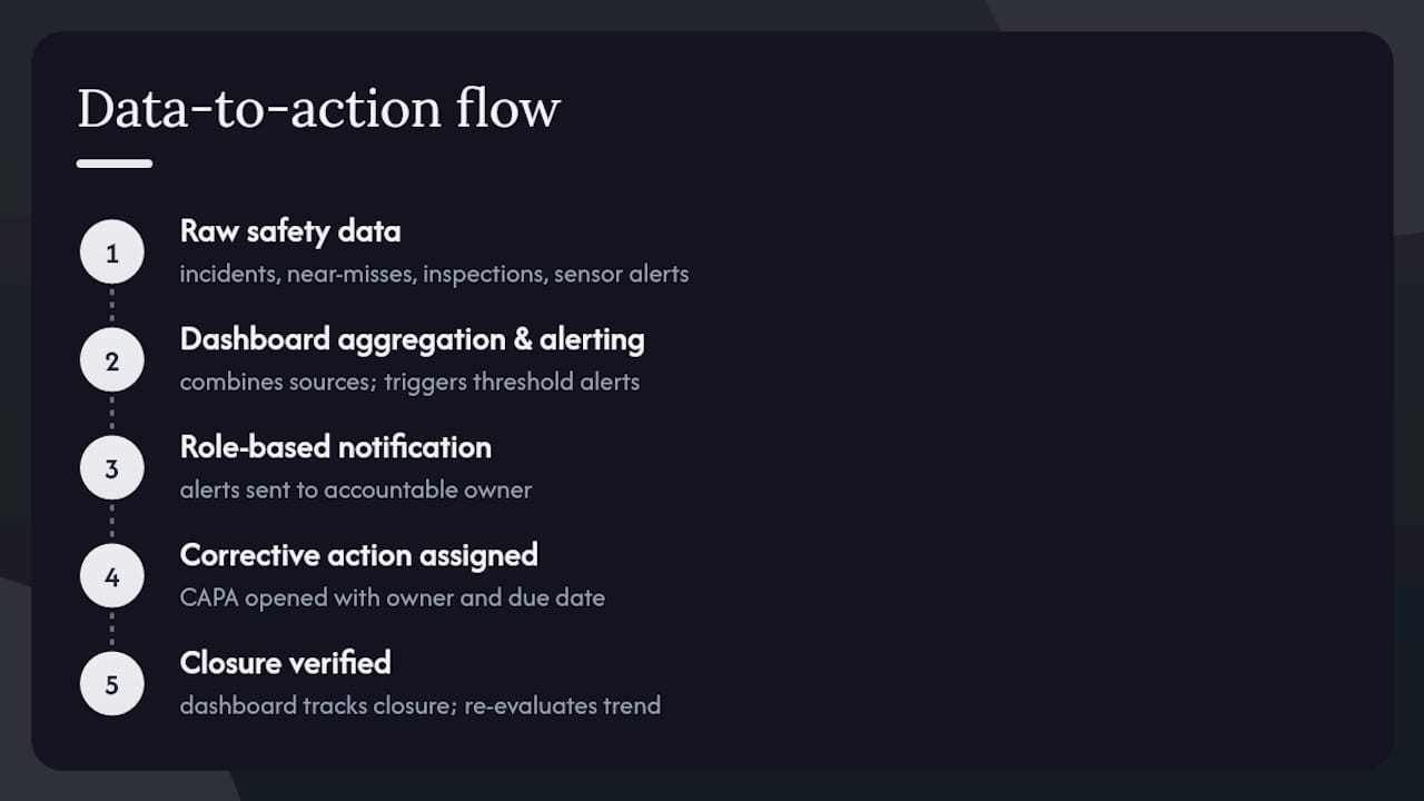
The data-to-action flow:
Raw safety data (incidents, near-misses, inspections, sensor alerts) → Dashboard aggregation and threshold alerting → Role-based notification to accountable owner → Corrective action assigned and tracked → Closure verified and trend re-evaluated. Each step is faster and more consistent than manual processes, and the audit trail is automatic.
FHWA’s guidance on safety data dashboards reinforces this architecture, describing dashboard components and data sources that support reliable safety monitoring and public reporting — a framework directly applicable to workplace EHS programs.
Which KPIs to track and how the 5-second rule applies
An effective safety dashboard balances 8–12 core KPIs drawn from both leading and lagging indicator categories. Exceeding that range dilutes attention; falling below it risks missing critical signals. The recommended KPI mix combines incident, inspection, training, hazard report, and corrective-action data to provide a live, actionable performance view.
Leading indicators (predictive, supervisor and EHS manager level):
- Near-miss report frequency (by site, crew, or zone)
- Inspection completion rate (scheduled vs. completed, by period)
- Training and certification compliance rate (by role and contractor)
- Hazard observation count (submitted by frontline workers)
- Overdue corrective actions (count and aging)
- Safety walk frequency (supervisor-level leading behavior)
Lagging indicators (outcome-based, EHS manager and executive level):
- Total Recordable Incident Rate (TRIR)
- Days Away, Restricted, or Transferred (DART) rate
- Lost-time incident frequency rate (LTIFR)
- Severity rate (total days lost per period)
- First-aid case count (as a proxy for near-miss severity)
The 5-second rule is the practical design constraint that governs KPI selection: every metric on a dashboard must be interpretable — status understood, action implied — within five seconds of viewing. If a user needs to click through, cross-reference another report, or recall context to understand what a metric means, it does not belong on the primary view. Effective dashboards combine balanced KPIs with clear visual hierarchy and role-based views precisely because the 5-second threshold is what separates a monitoring tool from a reporting archive.
KPI governance: review the KPI set quarterly. Remove any metric that has not triggered a decision or action in the prior 90 days — it is consuming visual space without generating value. Refresh leading indicators daily; lagging indicators weekly or monthly depending on incident volume.
Where dashboard data comes from and how integrations work
Dashboards are only as reliable as the systems feeding them. The authoritative source systems for a well-governed safety dashboard program are: an incident management platform (for incident and near-miss records), digital inspection and audit tools (for inspection completion and findings), an HR or learning management system (for training and certification records), and, where applicable, IoT sensors (for environmental and equipment monitoring). NHTSA’s Fatality Analysis Reporting System (FARS) illustrates the value of authoritative external datasets for benchmarking — a model that workplace programs can replicate by incorporating industry-level OSHA benchmark data alongside internal metrics.
Integration patterns fall into three categories. ETL (extract, transform, load) pipelines to a central data warehouse offer the most flexibility and are appropriate for enterprise programs with dedicated data engineering resources. Direct API feeds from cloud-based EHS platforms provide near-real-time data with lower infrastructure overhead and suit mid-sized programs. Lightweight connectors or pre-built integrations within dedicated safety dashboard systems reduce the time spent reconciling spreadsheets and enable teams to focus on insight rather than data preparation — the right starting point for most organizations piloting their first dashboard.
Minimum data-quality checklist before going live:
- Definitions: Every metric has a documented, agreed definition (e.g., what constitutes a “near-miss” vs. a “hazard observation” in your program).
- Timestamps: All records carry accurate, system-generated timestamps — not manually entered dates.
- Ownership: Each data feed has a named owner responsible for completeness and timeliness.
- Freshness: Maximum acceptable data lag is documented and monitored (e.g., incident records must appear in the dashboard within 24 hours of submission).
A brief privacy and security note: dashboards that surface employee-level records — individual training status, named incident involvement — must comply with applicable data protection requirements and align with OSHA’s employee records confidentiality standards. Role-based access controls are not optional; they are a governance prerequisite.
Design principles for clear, action-focused safety dashboards
The governing design principle is visual hierarchy: the most urgent, actionable information occupies the top-left position on every view, because that is where trained readers look first. Color logic follows a simple, unambiguous convention — red for threshold breaches requiring immediate action, amber for conditions approaching a threshold, green for compliant status. Avoid using color as decoration; every color on a safety dashboard must carry a defined operational meaning.
For field and mobile use, responsive widget design is non-negotiable. Supervisors on active construction sites are not reviewing dashboards on desktop monitors; they are checking status on tablets or smartphones in variable lighting conditions. Widgets must render legibly at mobile screen sizes, and critical functions — submitting a hazard report, acknowledging an alert — must be accessible within two taps. Offline resilience, where the app caches the last known state and queues submissions for sync, prevents data gaps during connectivity interruptions on remote sites. Digital tools integrated into construction workflows address precisely this field-use challenge.
A well-structured dashboard view typically includes: KPI tiles (current value vs. target, with status color), trend sparklines (30-day or 90-day trajectory for key metrics), a site or zone heat map (incident or inspection density by location), an open-actions table (owner, due date, days overdue), and an incident timeline (chronological log of recent events).
Pro Tip: Design for role-based views from the outset, not as an afterthought. A site supervisor and a VP of Safety need fundamentally different information at fundamentally different granularities. Building one dashboard and filtering it for different users is a compromise that satisfies neither. Allocate the design time to build distinct views; the governance overhead is minimal compared to the adoption gains.
Step-by-step rollout checklist for a successful dashboard program
The recommended rollout sequence is pilot, validate, then scale. A pilot scoped to one or two sites, two or three dashboards, and a 30–60 day measurement window generates the evidence needed to justify broader investment and surfaces data-quality issues before they propagate across the program.
Rollout checklist:
- Stakeholder alignment: Confirm executive sponsorship, identify dashboard owners for each view, and document the decisions each dashboard is intended to support.
- Data mapping: Inventory all source systems, document data definitions, and confirm integration feasibility with IT or the platform vendor.
- Build: Configure dashboards against agreed KPI sets and role-based access controls. Limit the pilot build to the incident insights and CAPA dashboards.
- Validate: Run the dashboard in parallel with existing reporting for two weeks. Identify discrepancies, resolve data-quality issues, and confirm that alerts trigger correctly.
- Train: Conduct role-specific training for supervisors, EHS managers, and executives. Focus on interpretation and response protocols, not platform mechanics.
- Measure: Track pilot success criteria (see below) over the 30–60 day window.
- Iterate and scale: Incorporate user feedback, resolve remaining data issues, and add dashboard types in the priority sequence described above.
Governance roles and responsibilities:
| Role | Responsibility | Review Cadence |
|---|---|---|
| Dashboard Owner (EHS Manager) | Approves KPI definitions, threshold settings, and access controls | Monthly |
| Data Feed Owner (IT / Platform Admin) | Maintains integration health, monitors data freshness, resolves feed failures | Weekly |
| Alert Reviewer (Site Supervisor) | Acknowledges and acts on operational alerts within defined SLA | Daily |
| Executive Sponsor | Reviews portfolio dashboard, approves program changes, champions adoption | Monthly |
If any criterion is unmet, extend the pilot and resolve the root cause before scaling.
Common pitfalls and how to avoid them
The most pervasive failure mode in safety dashboard programs is not technical — it is data quality. A dashboard built on incomplete, inconsistently defined, or stale data does not merely fail to add value; it actively misleads decision-makers, creating false confidence in a safety posture that the underlying data cannot support.
The core limitation to internalize before building:
A safety dashboard is a mirror, not a sensor. It reflects the quality and completeness of the data fed into it. If incident reporting is under-utilized, if inspections are logged inconsistently, or if training records lag by weeks, the dashboard will show a falsely favorable picture. Governance of the data pipeline is as important as the design of the dashboard itself.
Alert fatigue is the second major pitfall. When every threshold breach generates a notification, users begin ignoring alerts — including the ones that matter. Mitigate this by tiering alerts (critical, warning, informational), routing them to the role best positioned to act, and reviewing threshold settings quarterly to ensure they reflect current operational risk levels rather than default configurations.
Additional pitfalls and mitigations:
- Overfitting the dashboard: Building a view so specific to one site’s current conditions that it cannot scale or adapt. Design for the general case; configure for the specific.
- Privacy exposure: Surfacing named employee records in shared views. Enforce role-based access controls and audit access logs quarterly.
- Dashboard as substitute for investigation: A dashboard identifies that an incident occurred and flags a trend; it cannot replace the structured investigation required to determine root cause. Dashboards and human-led investigations are complementary, not interchangeable.
When dashboards are not the right tool: for low-volume programs (fewer than 10 recordable incidents per year across a single site), a well-maintained spreadsheet with a defined review cadence may deliver equivalent value at lower implementation cost. Dashboards justify their overhead when data volume, site count, or regulatory complexity exceeds what manual reconciliation can manage reliably.
Three concrete use cases across healthcare, construction, and general workplace
1. Healthcare: patient and staff safety monitoring
The dashboard objective in healthcare is to track both patient safety events and staff injury metrics within a single operational view, enabling clinical safety officers to detect adverse event clusters before they become reportable sentinel events.
Suggested KPIs (daily refresh): adverse event count by unit, near-miss report frequency, staff needlestick and sharps injury rate, patient fall rate, and infection control audit compliance. The data sources are electronic health record (EHR) systems, incident reporting platforms, and HR training records. The clinical safety officer reviews the inspection records for that unit, identifies a gap in equipment maintenance compliance, and initiates a targeted audit — preventing a potential adverse event rather than responding to one.
2. Construction: site hazard and compliance monitoring
Construction safety dashboards address the sector’s particular exposure profile: high-consequence hazards (falls, struck-by, electrocution, caught-in/between), multi-contractor sites, and regulatory scrutiny from OSHA enforcement. Real-time safety monitoring on construction sites is the operational foundation that dashboards formalize and scale.
Suggested KPIs (real-time to daily): near-miss count by zone, scaffold and fall-protection inspection compliance rate, contractor induction completion rate, open CAPA count by severity, and TRIR. Data sources include digital site inspection forms, contractor management systems, and IoT sensors for environmental conditions. A practical example: the dashboard registers three open fall-protection corrective actions on the same floor level, all overdue by more than five days. The site supervisor receives an escalation alert, conducts an immediate site walk, and closes two actions on the spot while escalating the third to the EHS manager for a procedural review.
3. General workplace: EHS program performance monitoring
For multi-site employers in manufacturing, logistics, or office environments, the dashboard objective is program-level performance visibility: are all sites meeting training, inspection, and incident reporting requirements, and where are the outliers?
Suggested KPIs (weekly refresh): training completion rate by site and role, inspection compliance rate, DART rate by business unit, hazard observation submission rate, and overdue corrective action count. Data sources are HR and LMS platforms, incident management systems, and audit tools. The EHS coordinator schedules targeted training sessions for that site, preventing a compliance gap before the next regulatory inspection cycle.
How to measure dashboard value and calculate ROI
Dashboards deliver measurable ROI through two primary mechanisms: reducing the frequency and severity of incidents (and their associated direct and indirect costs) and recovering the time safety teams previously spent on manual data reconciliation and report preparation.
Baseline and target template:
Before deploying a dashboard, document the current state across four dimensions: average time to close a corrective action (days), number of hours per week spent on manual safety reporting, TRIR for the prior 12 months, and inspection completion rate. Set 12-month targets for each. The delta between baseline and target, expressed in financial terms, is the basis for the ROI calculation.
Sample ROI calculation (conservative assumptions):
A mid-sized construction program with 200 workers, a baseline TRIR of 3.2, and two EHS staff spending 10 hours per week each on manual reporting. At a fully loaded labor cost of $75 per hour, that represents $45,000 in recovered productive capacity per year, before any reduction in incident costs is counted. A single prevented lost-time incident, with average direct and indirect costs exceeding $40,000 per event according to OSHA’s cost estimator, can alone justify the program investment.
Safety analytics in construction risk management provides the analytical framework for connecting leading indicator improvements to eventual lagging indicator gains. Expect a 6–12 month lag between improvements in leading indicators (near-miss reporting frequency, inspection compliance) and measurable reductions in TRIR or DART rate. That timeline is not a failure of the dashboard; it reflects the causal distance between prevention activity and outcome.
What peer-reviewed and government research says about safety dashboards
The evidence base for safety dashboards spans peer-reviewed clinical research, federal transportation guidance, and practitioner literature — a convergence that strengthens the case for investment across sectors.
- PubMed (2021): A peer-reviewed study on visual display of patient safety data confirms that visualization methods support effective monitoring of safety events and trend discovery. The implications extend beyond healthcare: the core finding — that structured visual presentation of safety data improves detection and response — applies to any high-consequence operating environment.
- FHWA: The Federal Highway Administration’s guidance on safety data dashboards describes recommended dashboard components, core and optional data sources, and design principles for reliable public safety monitoring. The structural framework it describes — authoritative data sources, defined refresh cadences, layered access — translates directly to workplace EHS programs.
- OSHA: As the primary U.S. regulatory authority for workplace safety, OSHA’s reporting requirements and recordkeeping standards define the compliance floor that dashboard metrics must address. TRIR, DART rate, and 300 Log data are the minimum lagging indicators any U.S. workplace dashboard should surface.
- Sitemate: Practitioner guidance confirms that most organizations have a speed and visibility problem rather than a data volume problem — dedicated dashboard systems solve timeliness and visibility more than they solve data scarcity.
- Simple But Needed: Effective dashboard design requires balanced leading and lagging KPIs, clear visual hierarchy, role-based views, timely data, and governance — a framework that practitioners consistently validate across industries.
- Field1st: The safety KPI dashboard framework recommends limiting the core KPI set to 8–12 metrics, tailored to the specific work risks of the sector, to preserve actionability and avoid noise.
- Tekmon: EHS dashboards enable real-time visibility, automated compliance tracking, and CAPA workflows — capabilities that practitioners consistently cite as the primary drivers of faster corrective action closure.
- Geckoboard: Health and safety dashboard examples illustrate how consolidated metric views — incident counts, training completion, risk-assessment status — function as the operational single source of truth for safety programs.
A QES consultancy’s perspective on dashboard pilots
The most consistent error MOSAIC observes when construction clients approach dashboard implementation is scope inflation at the outset. Organizations attempt to build five dashboards simultaneously, connect eight source systems, and train every role in the first 30 days — and then stall when data-quality issues surface in week three.
The more disciplined approach: identify the single highest-exposure workflow on your most active site, instrument it with one operational dashboard (incident insights or CAPA), and measure the impact within 60 days. That constraint forces clarity about what data you actually have, what decisions the dashboard is genuinely intended to support, and whether your source systems are ready for integration. A 60-day pilot with a narrow scope produces more actionable evidence than a 6-month program that never fully launches.
Governance cadence matters as much as the initial build. A dashboard that is not reviewed on a defined schedule — weekly for operational views, monthly for executive views — degrades into a reporting artifact rather than a decision tool. Assign a named reviewer, document the review protocol, and treat a missed review as a governance failure, not an administrative oversight.
MOSAIC’s QES consultancy services for safety dashboard implementation
Safety managers who recognize the value of dashboards but face the practical challenge of data mapping, system integration, and governance design have a structured path forward through MOSAIC Ecoconstruction Solutions. MOSAIC’s QES consultancy practice covers the full implementation lifecycle: pilot scoping and dashboard design, data source auditing, governance framework development, role-based training, and ongoing compliance support — all grounded in construction-sector regulatory requirements and field-tested across active project environments.

The pilot engagement is designed to produce measurable results within 60 days: a live operational dashboard, a validated data pipeline, and a documented governance protocol that your team can sustain independently. MOSAIC’s safety audit and compliance services provide the audit-readiness foundation that dashboard programs require to surface credible, defensible compliance evidence. For construction companies, developers, and project managers ready to move from manual reporting to real-time safety intelligence, the next step is a scoping conversation with MOSAIC’s QES team.
Sources
The following sources provide the evidentiary foundation for the claims in this article and are suitable for citation in business cases, regulatory submissions, and program proposals.
- Dashboards for visual display of patient safety data – PubMed
- Understanding Safety Data Dashboards | FHWA
- Osha
- Health and Safety Dashboard Examples
This article provides general informational guidance on safety dashboard design and implementation. Safety managers should verify all regulatory requirements with OSHA and qualified safety professionals before finalizing compliance-related dashboard configurations.